What is Neumorphism Design and Why is It Important?
It is a quiet afternoon and you are just scrolling through your phone. You do not think that the buttons you tap, the sliders you adjust or the cards you swipe. They are just… there. But have you ever paused to wonder why certain interfaces feel so intuitive? Or why some digital buttons seem almost touchable even though they are just pixels?
The answer often lies in design trends. And one of the more intriguing, almost poetic, styles to emerge in recent years is neumorphism. It is not just a buzzword thrown around by designers to sound. It is a concept that challenges how we interact with digital products. But before we dive into its mechanics and significance, let us take a moment to explore what exactly this trend entails.
What is Neumorphism?
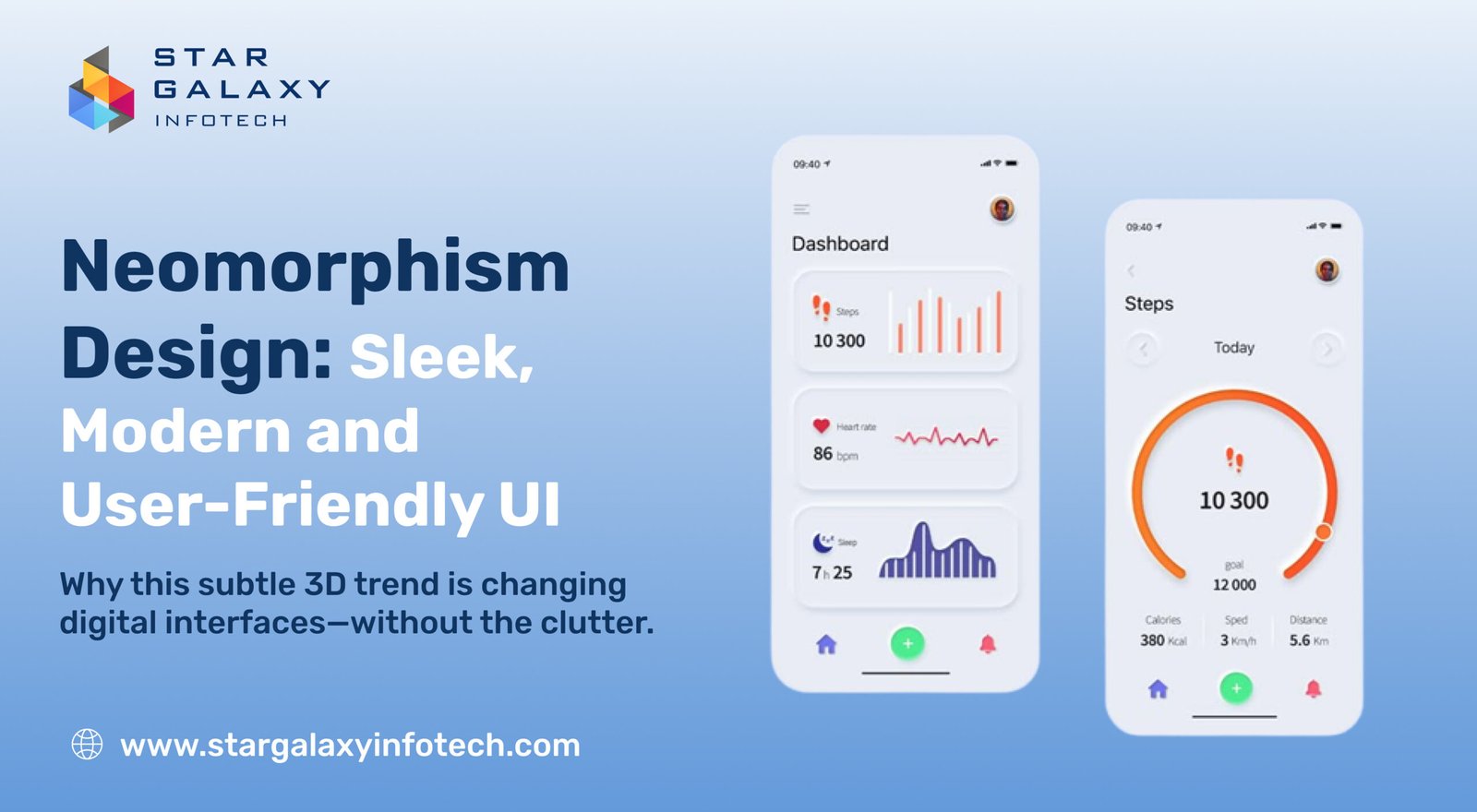
Neumorphism a blend of the words “new” and “skeuomorphism”, is a visual design trend that produces interfaces that feel soft, extruded and vaguely three-dimensional. It manipulates light, shadow and hue to mimic depth and touch surfaces, making UI components have a real-world, nearly tangible look.
Visualize a digital button that does not scream “CLICK ME” in flashy colors, but rather floats up from the background like a piece of pale plastic. That is neumorphism. It is minimalist, refined and strongly aesthetic.
The term picked up speed in about 2020, being championed by designer Alexander Plyuto and websites like Dribbble, as well as being embraced by UI/UX development companies looking for fresh, modern aesthetics. Though it takes cues from skeuomorphism, a design school that emulates real materials this is done in a more minimalist, modern fashion. Neumorphism tends to exist on a thin visual spectrum with monotone backgrounds and extreme dependence on subtle contrast.
Core Characteristics of Neumorphic Design
Neumorphism is defined by a unique set of visual characteristics that distinguish it from other design styles. These fundamental characteristics are:
1. Soft Shadows :
Neumorphic objects utilize two shadows a lighter shadow on one side and a darker one on the other. This creates a sense of depth, causing components to resemble they are extruded out or inset into the background.
2. Monochromatic Color Palettes :
Designers usually employ a single base color (most commonly grey, pastel or off-white) for both the background and UI components. The distinction arises not from color, but from the interplay of light and shadow.
3. Minimalist Aesthetic :
Clutter has no place in neumorphism. The aesthetic relies heavily on minimalism clean lines, simple forms and generous white space to maximize the illusion of subtle depth.
4. 3D-like Interfaces:
As opposed to flat design in which all seems printed on paper, neumorphism adds the tactile aspect. Sliders, buttons and cards are pressable or molded looking, resembling soft plastic molded into your screen.
5. Realistic Interactions :
Neumorphic UI tries to recreate the experience of touching something. Toggle switches have the sensation of being flipped manually. Buttons seem soft and pressable, like they react to your finger’s pressure.
Neumorphism vs Other Design Styles
Skeuomorphism
Flat design had yet to rise to power when skeuomorphism was reigning supreme. Consider Apple’s early iOS interfaces, in which notes resembled actual yellow legal pads and calculators emulated actual machines. Neumorphism borrows from the realism but eliminates the clutter and photorealistic specifics.
Flat Design
Flat design rose as a reaction to skeuomorphism. It emphasized simplicity, bright colors and a 2D aesthetic. While it improved usability and speed, it often lacked depth and intuitiveness. Neumorphism attempts to find a middle ground retaining simplicity while reintroducing depth.
Material Design
Evolved by Google, Material Design brought shadows and layering to achieve a realistic look while still keeping the UI clean. Neumorphism is lighter and less aggressive in its shadow usage, instead striving for a natural, tactile feel rather than a rational stacking of layers.
Why is Neumorphism Important?
Although others view it as simply a design element, neumorphism has more meaning in terms of design philosophy and user experience:
1. Connects Visual and Tactile UX
In an era where touchscreens rule, neumorphism brings digital interaction into line with the touch of real objects. It imperceptibly simulates the depth and feedback we associate with real buttons, making things easier to use.
2. Inspires Emotional Connection
Neumorphism’s gentle, affable look can bring comfort and familiarity. It works particularly well in wellness, finance or productivity apps where soothing, non-intrusive imagery enriches the experience.
3. Brings a New Perspective
Thanks to the past decades overwhelming prevalence of flat and material design, neumorphism brings the welcome change. Its contemporary with a retro vibe will appeal both to those chasing innovation and reminiscing about older interfaces more realistic feel.
4. Instigates Design Experimentation
Designers love it because it subverts conventions. It requires a more sophisticated comprehension of light, space and user response. This pressure to be creative and accurate is an indication of design progress.
Limitations and Challenges
Though appealing, neumorphism has its shortcomings. Actually, there are criticisms which are quite severe from a usability perspective.
1. Poor Accessibility
Low contrast is a defining characteristic of neumorphism and a significant accessibility issue. Visually impaired users might have difficulty telling buttons, cards or input fields apart.
2. Excessive Dependence on Light Source
The realism of neumorphism relies on uniform lighting and shadows. Any discrepancy can shatter the illusion or cause confusion. Creating a responsive neumorphic UI across devices and screen types is a true challenge.
3. Scalability Issues
Its subtle effects do not always scale well across screen resolutions or dimensions. On smaller screens, the gradients and shadows might become undistinguishable or just consume too much visual real estate.
4. Performance Considerations
Large usage of shadows and gradients can put a performance burden, particularly on mobiles or in high-complexity apps. Therefore, it is less appropriate for high-performance settings.
Final Thoughts
Neumorphism is not a temporary design trend it is a declaration of how we perceive digital spaces. It pushes designers to reimagine, breaking the boundaries between visual appeal and interactive usability.
It might not be perfect for all use cases particularly where accessibility is an issue but it is unquestionably engaging. Amidst a sea of flat, unadventurous interfaces, neumorphism is a breath of fresh air. Or rather, the gentle indentation of a button you never thought you would press, but now cannot stop pressing.


Amazing! Its actually remarkable piece of writing, I have got much clear idea regarding frkm thnis post. http://boyarka-inform.com/